Electrical Japan [1] [ja], a website by researcher Asanobu Kitamoto [2] [ja] lets you explore electric power plants and energy consumption in Japan through data-visualization.
 [1]
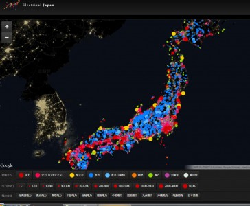
[1]Screenshot of power plant database compiled by researchers at Electrical Japan
The color of the dots represents the type of power plant, for example fossil-fuel plants are red and hydroelectric plants are blue. The size of the dot represents the amount of power generated. Users can also explore real-time energy consumption [3] [ja] on a regional basis through this map.